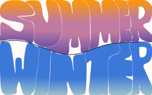
Our challenge was we create a colour contrast bookmark. Our idea was themed summer and winter which made our design even better. We chose our colours that was involved around the summer and winter colours. My partners Densyn and Matheus chose the colours to match the theme of our design.
I think this activity was creative and colourful beacause of the colour choice we chose.
Mōrena Riley,
This is such a fun activity as I love art and seeing everyone’s different interpretations of summer. I think your bookmark looks great. I love your use of the words summer and winter, and I agree that your colours contrast each other quite well. Your use of bubble lettering is quite cool too. I see that you completed this art work as a group, what was your favourite part of doing this activity with your friends?
When I think of summer time, the first thing that comes to mind is the beach so if I was to complete this activity I would definitely design a beach themed bookmark!! Do you go to the beach often in summer?
It is great to see you participating in the summer learning journey again this year and I look forward to seeing more of your awesome posts, keep up the great work!
Ngā mihi nui,
Zana Yates
SLJ
Kia Ora Zana thank you for commenting on my blog. My favourite part of working as a group is selecting the colours because we had a hard time trying to select the perfect colours.
Regards,
Riley